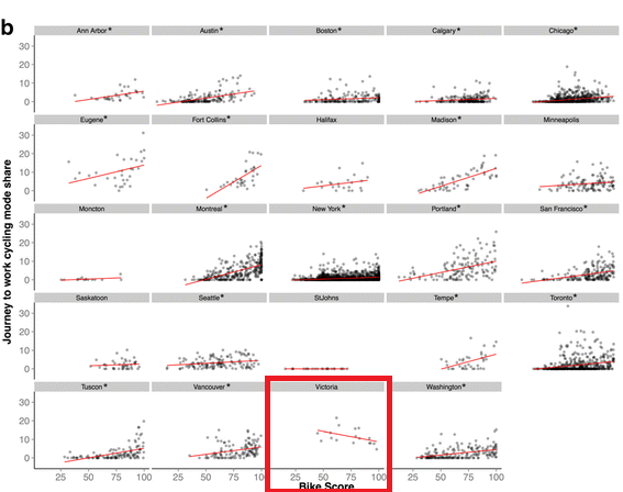
SFU’s Meghan Winters recently completed a paper looking at Bike Score and bike mode share (SFU news article) across several US and Canadian cities. The findings were as you would expect: higher Bike Score means higher bike mode share (to work). Except Victoria:

It looks like our bike score is actually negatively correlated with Bike Score. But why? Let’s look at where people bike in Victoria:

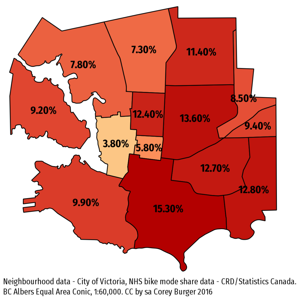
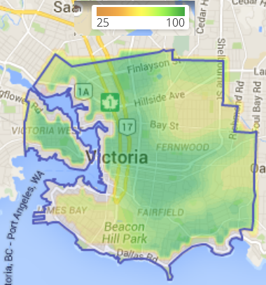
We have really high bike share in the south and east, but those areas show up very low in Bike Score. Conversely, there is low bike mode share in the north, especially Burnside/Gorge. Downtown and Harris Green also have low bike share largely because most people walk to work. But all these low mode share neighbourhoods have high Bike Scores:

I have long suspected that Bike Score relatively simplistic breakdown of “bikeability” is a bit too simple. This isn’t really the fault of the Bike Score people, it really is a data problem. Good data about whether a street is “bikeable” simply isn’t available. What is available is infrastructure and topography.
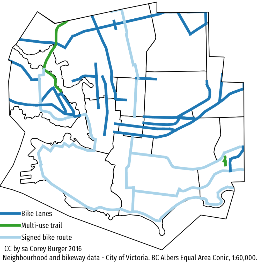
In our case, most of the bike infrastructure that Bike Score tracks goes east or north/west – bike lanes on Douglas/Blanshard/Government or Fort/Yates/Pandora/Johnson and the two regional trails which run north/west.

Still, Bike Score is a valuable first-cut of a tool to help figure out what is happening. That Victoria doesn’t fit the pattern isn’t surprising, we are the anomaly when it comes to mode share – being several percentage points ahead of the next highest city in Canada. To better capture where people bike, I would love to see Bike Score innovate and do something similar to the CRD comfort index and use that instead of pure infrastructure, but given the massive data challenges, I am not holding my breath.
One thought on “Bike mode share vs Bike Score: Why is Victoria so weird?”
Comments are closed.